Building Tabbed Navigation using SpryTabbedPanels

The current trend in web design is the use of Tabbed Navigation. This feature is easily identifiable in blogs, with sections like ‘Featured Content’ or ‘Latest’ organized under tabs. Tabs can proficiently be instated at the top of a site, taking the place of conventional menu items. They not only give your site a rejuvenated feel, save resources, but also permit maximum information presentation in a space-efficient manner. Moreover, majority of users are quite adept at navigating tabs and their respective features. The tab-related keys such as Tab, ALT+Tab, and Ctrl+Tab are among the most frequently used on keyboards universally. If you are contemplating the integration of tabbed navigation into your web design, we’re here to help you. Adobe Labs offers its SpryTabbedPanels free of charge. We’ll guide you on how to utilize the SpryTabbedPanel code to create your own Tabbed Navigation.

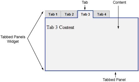
An outer div contains – list of tabs, all panels, div container to have content panels, and div tag for each panel. The SpryTabbedPanels use JavaScript to toggle between the tabs. Therefore, we’ll include the JavaScript code within the HTML tag. To modularize the code, we’ll create a separate JS file and link it through script tag inside head tag. This js file will define the functions related to the Tabbed Panel. Before closing the body tag, we’ll define a script tag to use JavaScript to make Tabbed Panel interactive. We’ll also link a style sheet in the head tag.
Adobe Labs provide the SpryTabbedPanels.js to use with the HTML code. You can scroll down to bottom to download the source files used in this article. Before that, we’ll illustrate the code of HTML and CSS files in this article. We recommend you not to change the file name of js and css files. However, you can modify the code as per your convenience.
In our case, we’ve located JS, CSS and HTML files in the same folder. Please modify the path in code if you’re placing the CSS and JS files in other location.
CSS Code
.TabbedPanels {
	margin: 0px;
	padding: 0px;
	clear: both;
	width: 100%; /* IE Hack to force proper layout when preceded by a paragraph. (hasLayout Bug)*/
}
.TabbedPanelsTabGroup {
	margin: 0px;
	padding: 0px;
}
.TabbedPanelsTab {
	position: relative;
	top: 1px;
	float: left;
	padding: 4px 10px;
	margin: 0px 1px 0px 0px;
	font: bold 0.7em sans-serif;
	background-color: #DDD;
	list-style: none;
	border-left: solid 1px #CCC;
	border-bottom: solid 1px #999;
	border-top: solid 1px #999;
	border-right: solid 1px #999;
	-moz-user-select: none;
	-khtml-user-select: none;
	cursor: pointer;
}
.TabbedPanelsTabHover {
	background-color: #CCC;
}
.TabbedPanelsTabSelected {
	background-color: #EEE;
	border-bottom: 1px solid #EEE;
}
.TabbedPanelsTab a {
	color: black;
	text-decoration: none;
}
.TabbedPanelsContentGroup {
	clear: both;
	border-left: solid 1px #CCC;
	border-bottom: solid 1px #CCC;
	border-top: solid 1px #999;
	border-right: solid 1px #999;
	background-color: #EEE;
}
.TabbedPanelsContent {
	padding: 4px;
}
.TabbedPanelsContentVisible {
}
/* Vertical Tabbed Panels */
.VTabbedPanels .TabbedPanelsTabGroup {
	float: left;
	width: 10em;
	height: 20em;
	background-color: #EEE;
	position: relative;
	border-top: solid 1px #999;
	border-right: solid 1px #999;
	border-left: solid 1px #CCC;
	border-bottom: solid 1px #CCC;
}
.VTabbedPanels .TabbedPanelsTab {
	float: none;
	margin: 0px;
	border-top: none;
	border-left: none;
	border-right: none;
}
.VTabbedPanels .TabbedPanelsTabSelected {
	background-color: #EEE;
	border-bottom: solid 1px #999;
}
.VTabbedPanels .TabbedPanelsContentGroup {
	clear: none;
	float: left;
	padding: 0px;
	width: 30em;
	height: 20em;
}
HTML Code
<head>
...
	<!--Link the Spry TabbedPanels CSS-->
	<link href="SpryTabbedPanels.css" rel="stylesheet" type="text/css" />
	<!--Link the Spry TabbedPanels JavaScript library-->
	<script src="SpryTabbedPanels.js" type="text/javascript"></script>
</head>
<body>
	<!--Create the Tabbed Panel widget and assign classes to each element-->
	<div class="TabbedPanels" id="TabbedPanels1">
		<ul class="TabbedPanelsTabGroup">
			<li class="TabbedPanelsTab">Tab 1</li>
			<li class="TabbedPanelsTab">Tab 2</li>
			<li class="TabbedPanelsTab">Tab 3</li>
			<li class="TabbedPanelsTab">Tab 4</li>
		</ul>
		<div class="TabbedPanelsContentGroup">
			<div class="TabbedPanelsContent">Tab 1 Content</div>
			<div class="TabbedPanelsContent">Tab 2 Content</div>
			<div class="TabbedPanelsContent">Tab 3 Content</div>
			<div class="TabbedPanelsContent">Tab 4 Content</div>
		</div>
	</div>
<!--Initialize the Tabbed Panel widget object-->
<script type="text/javascript">
	var TabbedPanels1 = new Spry.Widget.TabbedPanels("TabbedPanels1");
</script>
</body>
Categorizing the HTML code
- Link the SpryTabbedPanels.js and SpryTabbedPanels.css file within the HTML code.
<!--Link the CSS style  sheet that styles the tabbed panel-->
<link href="SpryTabbedPanels.css" rel="stylesheet" type="text/css" />
<!--Link the Spry TabbedPanels JavaScript library-->
<script src="SpryTabbedPanels.js" type="text/javascript"></script>
- Add following code to create the SpryTabbedPanel.
<div class="TabbedPanels" id="TabbedPanels1">
</div>
- Mention an ul class TabbedPanelsTab Group to create the tab inside above div.
<div class="TabbedPanels" id="TabbedPanels1">
	<ul class="TabbedPanelsTabGroup">
		<li class="TabbedPanelsTab">Tab 1</li>
		<li class="TabbedPanelsTab">Tab 2</li>
		<li class="TabbedPanelsTab">Tab 3</li>
		<li class="TabbedPanelsTab">Tab 4</li>
	</ul>
</div>
- Add a div ‘TabbedPanelsContentGroup, after the ul class to create a container for including the contents of each tab.
<div class="TabbedPanels" id="TabbedPanels1">
	<ul class="TabbedPanelsTabGroup">
		<li class="TabbedPanelsTab">Tab 1</li>
		<li class="TabbedPanelsTab">Tab 2</li>
		<li class="TabbedPanelsTab">Tab 3</li>
		<li class="TabbedPanelsTab">Tab 4</li>
	</ul>
	<div class="TabbedPanelsContentGroup">
	</div>
</div>
- In TabbedPanelsContentGroup, include one div tag with class (TabbedPanelsContent) for each tab to have its content.
<div class="TabbedPanels" id="TabbedPanels1">
	<ul class="TabbedPanelsTabGroup">
		<li class="TabbedPanelsTab">Tab 1</li>
		<li class="TabbedPanelsTab">Tab 2</li>
		<li class="TabbedPanelsTab">Tab 3</li>
		<li class="TabbedPanelsTab">Tab 4</li>
	</ul>
	<div class="TabbedPanelsContentGroup">
		<div class="TabbedPanelsContent">Tab 1 Content</div>
		<div class="TabbedPanelsContent">Tab 2 Content</div>
		<div class="TabbedPanelsContent">Tab 3 Content</div>
		<div class="TabbedPanelsContent">Tab 4 Content</div>
	</div>
</div>
- Include following code to initialize the SpryTabbedPanels object. Here, new operator will initialize the Tabbed Panels and transforms the div content with TabbedPanels1 ID into an interactive tabbed object.
<script type="text/javascript">
	var TabbedPanels1 = new Spry.Widget.TabbedPanels("TabbedPanels1");
</script>
What you can do more?
- If you want to add more tab then add a li class in TabbedPanelsTabGroup and a div class in TabbedPanelsContentGroup. To remove a tab, you’ve to delete the li class and its relevant div class from both groups.
- You can change the div class ‘TabbedPanels’ to ‘VTabbedPanels’ if you want to include the vertical tabs in your Web design.
<div class="VTabbedPanels" id="TabbedPanels1">
	<ul class="TabbedPanelsTabGroup">
		<li class="TabbedPanelsTab">Tab 1</li>
		<li class="TabbedPanelsTab">Tab 2</li>
		<li class="TabbedPanelsTab">Tab 3</li>
		<li class="TabbedPanelsTab">Tab 4</li>
	</ul>
	<div class="TabbedPanelsContentGroup">
		<div class="TabbedPanelsContent">Tab 1 Content</div>
		<div class="TabbedPanelsContent">Tab 2 Content</div>
		<div class="TabbedPanelsContent">Tab 3 Content</div>
		<div class="TabbedPanelsContent">Tab 4 Content</div>
	</div>
</div>
- Make use of tabIndex in li class ‘TabbedPanelsTab’ to enable keyboard navigation.
<li class="TabbedPanelsTab" tabIndex="0">Tab 1</li>
<li class="TabbedPanelsTab" tabIndex="1">Tab 2</li>
<li class="TabbedPanelsTab" tabIndex="2">Tab 3</li>
- You can set the default tab to open on loading the page by defining defaultTab with new constructor.
var TabbedPanels1 = new Spry.Widget.TabbedPanels("TabbedPanels1", { defaultTab: 2 });
Sample Output
We’ve run the code and got following output:-

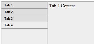
We’ve changed the code to get Vertical Tab Panel and received following output

Files
Click here to download zip archive having following source files used in this article:
- SpryTabbedPanels.css – has the source code of styles used to design tabs.
- SpryTabbedPanels.js – has the source code of scripts used to create tabs.
- SampleHorizontalTabs.html – has the code to show Horizontal Tabbed Panels.
- SampleVerticalTabs.html – has the code to show Vertical Tabbed Panels.
Conclusion
Tabbed Navigation is the easiest way to demonstrate the large and similar content in less space. SpryTabbedPanels make is very easy for you to include the Tabbed Navigation in your code. Is this article helpful? Inform us through your valuable comments. We’ll keep you posted with more such interactive articles in the future, stay tuned.


