10 Beautiful Interactive Infographics

The idea of interactivity amplifies the value of information in a natural way, enabling individuals to digest the content at their own pace and occasionally even contribute their own viewpoints. As a result, the rapid rise in popularity of dynamic infographics is entirely comprehensible; they showcase an abundance of extraordinary and aesthetically pleasing creations which infuse an intriguing twist into the visual and interactive aspects of infographic design.
You Vs. John Paulson
In this cleverly simple infographic, you can compare your annual income with that of John Paulson, the head of a New York Hedge Fund. A few stark statistics really bring the contrast home, furthered by an overwhelming tomato-red and slate grey color palette.

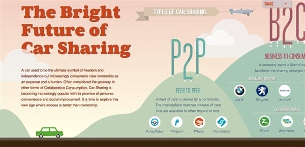
The Bright Future of Car Sharing
This infographic isn’t as heavily interactive as some of the others, which is a good choice when it’s a priority to limit confusion and distraction. The layout allows the user to have full control of the scrolling pace, which gives a nice sense of collaboration. This, along with the simple rollovers for details that aren’t necessary to the story, are nice touches for a graphic that has all the interest of interactivity, with none of the potential frustration.
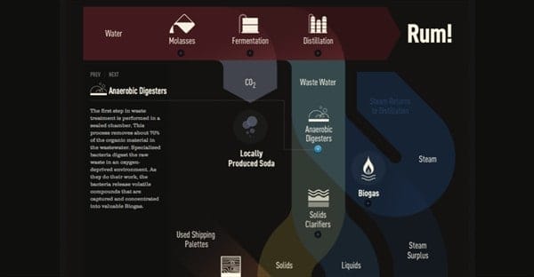
How to Make Eco-Friendly Rum
The complexity of this static infographic is complemented, rather than confused by its interactive elements. Because they all appear in the same column, with neat lines pointing to the topic at hand, they are again more about adding detail to a graphic that could also stand alone without accessing additional info.
What’s Your Slavery Footprint?
This site has an unusual take on interactivity in that it functions as a combination of questionnaire and infographic. It’s also fairly unique in that the user must move from page to page, instead of staying on the same image like most other infographics. It’s a great tactic for a subject that has thoroughly defined sections, plus it gives you lots of space to achieve a clean, simple design.
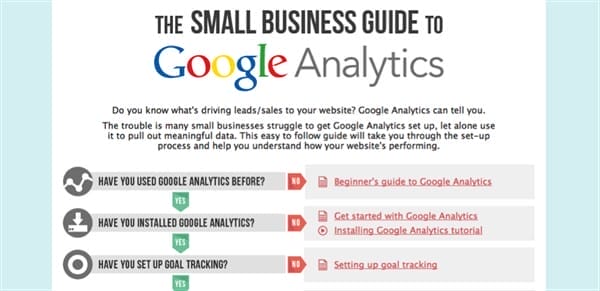
Google Analytics Guide
Sometimes an infographic needs barely any graphic flourishes to be a success. Such is the case with this guide to Google Analytics, which neatly organizes a thorough introduction to the service into the most simple set-up possible.
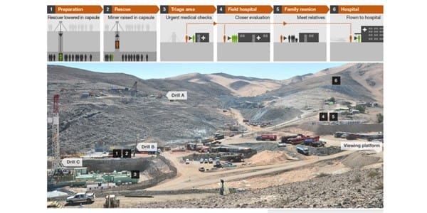
Chile Mine: Rescue Day Operation
This infographic offers a unique spin by incorporating photography, which is a rest from the continuous flood of flat, cutesy vector illustration. And it’s obviously a great choice when it comes to this topic, giving the audience a real sense of the scale of this rescue operation.
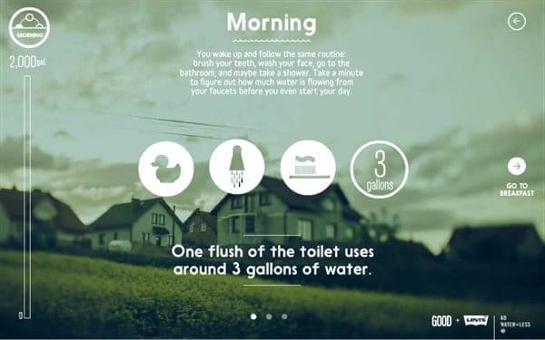
Your Daily Dose of Water
The photography here is being used more for effect than for information, but it’s a beautiful and fitting take on the topic.
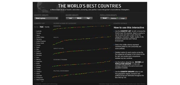
The World’s Best Countries
Due to the wealth of numbers that are contained in this fascinating chart, it was a good choice on the part of the designer to keep the interface as simple as possible; it really lets the information shine.
Foreign Language in US Higher Education
Another example of a complex chart being brought to life by simple, eloquent interactivity.

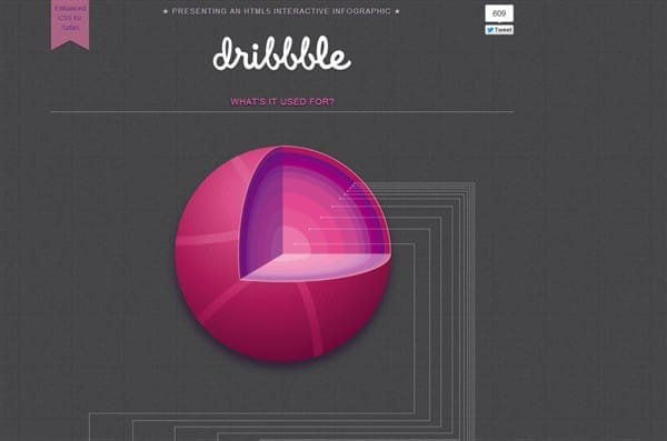
Who’s Using Dribbble
This infographic has an interesting feel because its works like a toy, with simple light-up and flip actions that feel like more of a way to play with the graphic instead of a means of revealing information. It’s an approach that works for less complex information, because it helps to add some texture to the experience.
Even in this small sampling, it’s impressive to see what an array of effects that interactivity can give to a graphic. And the area has yet to be fully explored, so there will likely be many interesting additions to this popular new trend.


