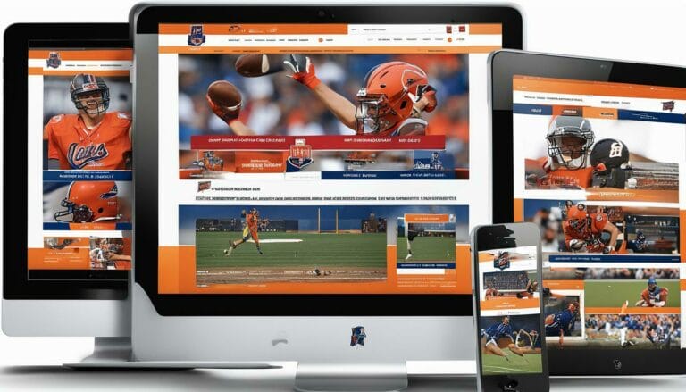
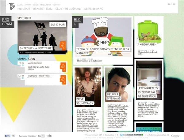
Typography- its Role in Creating Engaging Email Designs

Choosing the Right Typeface for Your Brand
Typography is not only a visual choice but also a strategic one. Selecting the right typeface is like choosing an outfit that reflects your brand’s personality and values. The typeface you choose conveys a message before the words are even read, making it a critical element in defining your brand identity. Whether it’s the classic elegance of a serif typeface, the modern simplicity of a sans-serif font, the flair of a script font, or the uniqueness of a display typeface, each option evokes a distinct vibe. For instance, a forward-thinking tech brand might opt for a sleek sans-serif typeface to convey innovation, while a high-end luxury brand might gravitate towards an elegant serif font to exude sophistication. Consistency is key – using the same typeface across your emails reinforces brand recognition and ensures a coherent visual identity. This strategic alignment between type and brand fosters a sense of familiarity and trust among recipients, enabling them to connect with your emails on a deeper level.Hierarchy: Guiding the Reader’s Eye
In the bustling world of email content, capturing and maintaining the reader’s attention is a delicate dance choreographed by the principles of hierarchy. The strategic arrangement of text elements, from headings to subheadings and body text sizes, orchestrates a visual journey that guides the reader’s eye through the email’s narrative. Much like a map, hierarchy provides cues that direct the reader’s focus to the most important content, ensuring that they engage with the core message. Mailchimp templates make your job of customizing easier. Starting with the subject line, the journey continues through captivating headings that serve as signposts, leading the reader to the crux of the email. Subheadings act as stepping stones, breaking down the content into digestible segments, and font weights and sizes act as a conductor’s baton, orchestrating emphasis on key points. This skillful arrangement doesn’t just facilitate comprehension; it also maintains intrigue, encouraging the reader to explore further. In this symphony of hierarchy, email marketing companies craft compositions that not only inform but also captivate, turning passive recipients into active participants in the narrative.Readability and Legibility: Ensuring Clear Communication
Typography’s impact goes beyond aesthetics; it’s the linchpin that bridges the gap between visual appeal and clear communication. Email marketing companies understand that even the most visually stunning design is rendered futile if readers struggle to decipher the text. Legibility is paramount, and it’s a harmonious interplay of various factors.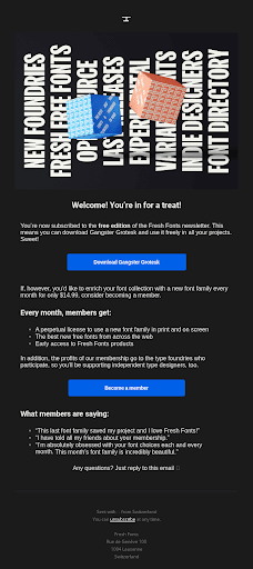 Source
Font selection, for instance, takes into account not only the design aspect but also the ease with which readers can consume the content. Fonts that are easy on the eyes, with well-defined shapes and appropriate spacing, are favored for their readability. Contrast plays an equally significant role – sharp contrast between text and background ensures text stands out, enhancing visibility.
Furthermore, the right font size strikes a balance between readability and aesthetic appeal, preventing readers from squinting or straining their eyes. This careful orchestration results in emails that are not just visually pleasing but also effortlessly comprehensible, ensuring that the message resonates with recipients as intended. Through meticulous attention to readability and legibility, email marketing companies ensure that the art of typography serves its ultimate purpose: seamless and impactful communication.
Emotional Resonance: Conveying Mood and Message
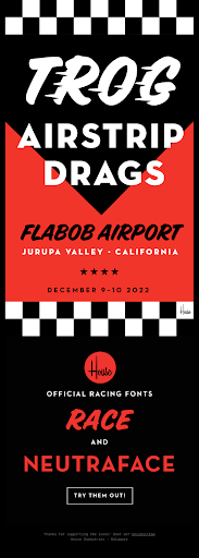 Typography is a silent communicator possessing a profound ability to evoke emotions and convey messages without uttering a word. Email marketing companies recognize the nuanced emotional impact of typography, leveraging it as a strategic tool to forge a deeper connection with recipients. The choice of typeface alone can set the mood; a flowing script font might infuse a sense of warmth and intimacy, perfect for conveying personal messages or invitations. On the other hand, a bold and clean typeface can command attention and exude professionalism, making it ideal for corporate communications. Even the spacing between letters and line height contributes to this emotional tapestry. Ample letter spacing can offer a sense of airiness and playfulness, while tightly kerned letters create a more compact and serious tone. In every email, email marketing companies meticulously select and arrange typographic elements to mirror the emotional resonance they intend to evoke. By harnessing this silent language, they create emails that transcend mere text and images, resonating on a visceral level with readers and eliciting the desired emotional response.
Source
Responsive Design: Typography Across Devices
The digital landscape is marked by diversity, with emails being accessed across an array of devices – from smartphones and tablets to desktops. In this multifaceted scenario, ensuring a seamless and consistent experience is the hallmark of successful email design, and typography is no exception. Email marketing companies understand the significance of responsive design, where the chosen typeface and layout adapt fluidly to various screen sizes. This adaptation extends beyond mere resizing; it encompasses readability, spacing, and legibility. By testing the email’s readability and visual integrity across a range of devices, these companies ensure that the typography remains equally impactful whether viewed on a compact smartphone screen or a larger desktop monitor. Typography is not just about the characters themselves; it’s about the entire visual rhythm they create. The alignment of typography with responsive design ensures that emails retain their aesthetic appeal, readability, and emotional resonance, regardless of the device in hand. Through this commitment to adaptability, email marketing companies pave the way for emails that make a lasting impression across the diverse spectrum of digital platforms.Color and Contrast: Enhancing Visual Appeal
The interplay of color and typography is a realm of creative possibilities that email marketing companies skillfully navigate. Beyond just an element of imagery, color extends its influence to typography, elevating visual appeal and imparting strategic emphasis. Through the careful selection of colors, text elements can be highlighted to draw attention, convey mood, or maintain brand consistency. The art lies in balance – utilizing color to amplify certain text elements while maintaining readability and cohesion. Email marketing companies recognize the importance of a well-defined color palette that aligns with the brand’s identity. By weaving this palette into typography, they infuse emails with vibrancy and personality, capturing the recipient’s eye and engaging them in a visually captivating experience.Whitespace: Allowing Breathing Room
Whitespace is the canvas upon which typography dances, an often underestimated design element that wields significant impact. Whitespace, or negative space, is not a void; rather, it’s a deliberate choice that offers a visual pause, enhancing readability and overall content comprehension. Email marketing companies embrace whitespace as a vital tool to create clarity and allow content to breathe. By incorporating generous whitespace around text elements, they prevent emails from appearing cluttered and overwhelming. This whitespace acts as a natural separator, delineating content blocks and guiding the reader’s eye with ease. The result is a harmonious composition where text is given room to shine, enhancing not only the aesthetic but also the accessibility of the email. In this way, whitespace is a conductor of the reader’s journey, orchestrating a symphony of readability and engagement that resonates with recipients.How Can Typography in Email Designs Be Optimized with Convertkit?
The importance of typography in email design cannot be overstated, and the email marketing instruments offered by Convertkit offer impressive ways to enhance it. By employing Convertkit, one can execute beneficial typographic tactics such as the selection of suitable fonts, proper alignment of texts, and effective content formatting, which in turn lead to the creation of visually pleasing emails. Taking advantage of Convertkit’s features, the impact of typography on your email designs can be dramatically magnified, resulting in more engaging emails for your audience.
How Can Typography Enhance the Design of Business Cards?
Typography is a vital component in enhancing creative business card designs. The choice of fonts, sizes, and alignment can communicate a brand’s personality and create visual appeal. Proper use of typography can improve readability, attract attention, and convey professionalism. By utilizing typography effectively, business cards stand out and leave a lasting impression on recipients.

